What Is Periwinkle Purple and How Does It Differ?
Just what makes periwinkle purple a captivating color, and how does it stand apart from other shades? Discover its unique charm inside.
Periwinkle purple is a soft hue that combines blue and purple tones, showcasing a pastel quality with subtle gray undertones. It evokes feelings of tranquility and creativity, often associated with femininity and everlasting love. Unlike other shades, periwinkle offers a unique balance, merging cooler blue influences with warmer purple aspects. This versatility makes it ideal for various applications in design and fashion. Discovering more about its symbolism and cultural significance can deepen your understanding of this enchanting color.
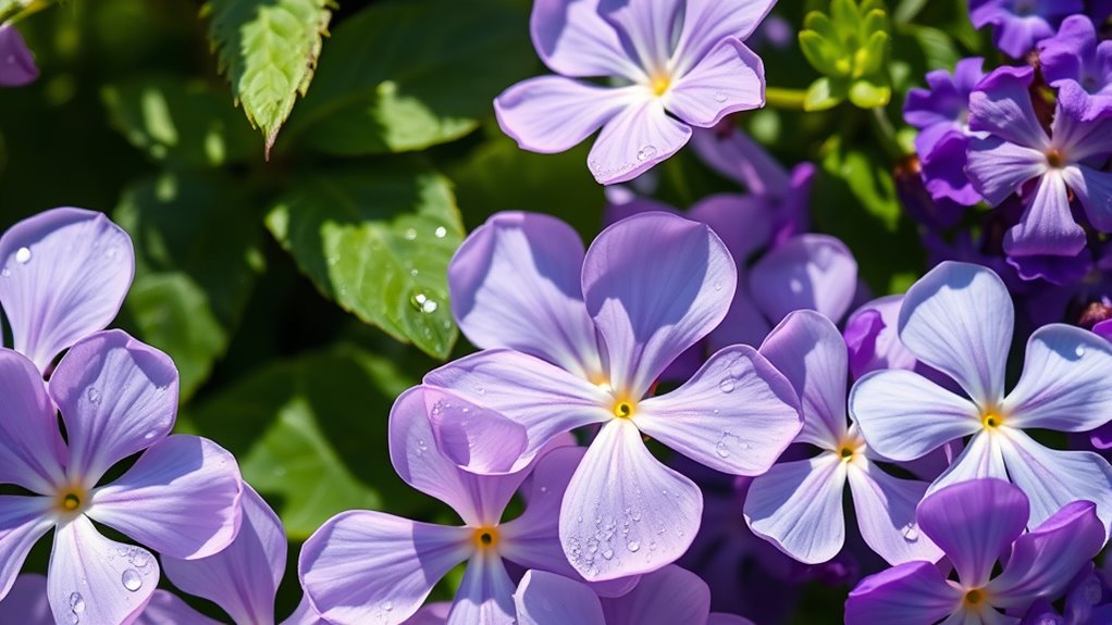
Periwinkle purple, a soft and enchanting hue, seamlessly merges blue and purple tones to create a pastel-like color that both captivates and soothes. This alluring shade, named after the periwinkle flower (*Vinca minor*), exhibits a blend of delicate pigmentation, representing a visual midpoint between blue and violet on the color wheel. You might recognize it by other names like lavender blue, light blue violet, or Myrtle in the U.S., but its historical roots trace back to natural dyes derived from the flower’s petals—imbuing the color with a unique narrative and natural charm.
As you explore the color’s characteristics, periwinkle reveals itself as a pale tint imbued with subtle gray undertones. The delicate balance it strikes between the coolness of blue and the creative calmness associated with purple fosters an inviting atmosphere. You’ll notice how periwinkle’s visual perception can shift depending on the context, sometimes leaning towards blue, while at others, it may show more purple influences.
Typically characterized by the hex code #CCCCFF, periwinkle possesses high lightness and saturation, mainly within the blue and red spectrums, reinforcing its classification as a cool color. Such cool traits render periwinkle effectively calming—a quality that amplifies its allure in various applications. In popular culture, periwinkle blue is notably associated with awareness ribbons for various health issues, enhancing its significance beyond just aesthetics.
In terms of psychological and symbolic meanings, periwinkle’s soft tones evoke feelings of serenity and tranquility, making it ideal for spaces designed to alleviate stress. This enchanting color symbolizes blossoming friendships, everlasting love, romance, femininity, and a rich creativity that flourishes in its presence. Additionally, its cool tones can elicit associations with winter and ice, further enhancing its calm and nurturing attributes. The merging of blue and purple allows periwinkle to evoke a sense of balance between logic and inspiration in artistic interpretations.
In design and fashion, periwinkle has gained popularity thanks to its ability to create comforting atmospheres infused with positive emotional associations.
When it comes to usage, periwinkle truly shines as a soft, airy pastel in interior design. You’ll find it employed to elicit peace and relaxation in bedrooms, meditation rooms, and creative spaces. Its versatility stands out as it complements an array of colors, including navy blue, gray, white, mint green, light pink, deep plum, and lavender.
This unique ability allows it to fit seamlessly into various color palettes, providing a balance between vibrancy and softness in fashion, branding, and home decor.
Visually, periwinkle offers a spectrum of variations that can enhance its appeal. Lighter versions trend towards lilac, embodying warmth and softness, while deeper shades reflect a stronger blue presence, yielding a more substantial impact.
Keep in mind that lighting and adjacent colors can influence the exact shade you perceive. When considering periwinkle in artistic applications, tints result from adding white, yielding pastel variations, whereas shades arise from adding black, deepening the hue.
This interplay, influenced by pigment saturation and application methods, showcases periwinkle’s complexity and rich visual identity in the art and design world.
Conclusion
To sum up, periwinkle purple isn’t just a color; it’s a vibrant symphony of blue and lavender that dances joyfully on the canvas of life. It effortlessly distinguishes itself from mere shades like lilac or indigo, embodying a blend that’s both serene and invigorating. This hue whispers stories of twilight skies and wildflower fields, enchanting the eye and stirring the soul. Embracing periwinkle means enveloping yourself in a color that transcends the ordinary, a masterpiece in every sense.


